

My recent stay at Universal Orlando Resort was so much fun and I’m going to share and highlight my favorite moments with you. First and foremost, I stayed at the Cabana Bay Beach Resort on the property which allowed me early access (one hour) to The Wizarding World of Harry Potter™. It was my first time experiencing Diagon Alley™. I took advantage of the complimentary shuttle service to Universal Studios Florida and was able to … [Read More...]
Life & Style

Navigating Disney World During a Pandemic
I recently had an opportunity to visit Walt Disney World as part of my Goofy Getaways FAM Training. It was exciting and I was a bit anxious because even though some restrictions are being lifted, guidelines are more relaxed, and travel is starting to … [Read More...]

Strike a pose at Pose Selfie Studio
I recently had an opportunity to visit the NEW Pose Selfie Studio in Raleigh, NC with my daughter and it was so much fun. The great thing about this studio is that you have all the tools you need to capture your perfect photos alone or you can go … [Read More...]

Safety First in the 2021 Mazda CX-5 Signature AWD
Traveling in current times can be a little challenging however, if you plan and take all the safety precautions you can lower your anxiety level and have a pleasant adventure. I am speaking my truth! Traveling brings me a sense of peace and I need my … [Read More...]

Taste the Flavors of St. Thomas USVI
I am excited to be collaborating with my fellow foodie lover Hannah Victoria on this listing of places to eat in St. Thomas USVI whether you are visiting or local to the island. We are giving you our personal opinions based on our dining experiences … [Read More...]
More Top Stories
Tech

Safety First in the 2021 Mazda CX-5 Signature AWD
Traveling in current times can be a little challenging however, if you plan and take all the safety precautions you can lower your anxiety level and have a pleasant adventure. I am speaking my truth! Traveling … [Read More...]

Making Moves in the 2020 Mazda CX-5 Signature AWD
The times we’re currently living in are uncertain to say the least. How can you try to create normalcy when everything seems to be out of whack? We can thank the COVID-19 Pandemic for this vital shift in life. … [Read More...]

Escape with Sony Wireless Noise Cancelling Headphones
I was beyond excited when I got the opportunity to review the Sony WF-1000XM3 wireless noise cancelling stereo in-ear headset and WH-XB900N wireless noise cancelling stereo headset with Extra Bass. Both headsets … [Read More...]
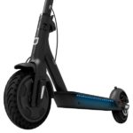
Getting Around Campus on the Jetson Quest Electric Scooter
Summer is pretty much over and we’re all in back to school mode! One thing I’ve noticed is that my kids have attended schools with very large campuses, from Middle School to High School and College. I get phone … [Read More...]
Travel

Universal Orlando Resort: Where to Stay & Play for a Few Days
My recent stay at Universal Orlando Resort was so much fun and I’m going to share and highlight my favorite moments with you. First and foremost, I stayed at the Cabana Bay Beach Resort on the property which allowed me early access (one hour) to … [Read More...]

Navigating Disney World During a Pandemic
I recently had an opportunity to visit Walt Disney World as part of my Goofy Getaways FAM Training. It was exciting and I was a bit anxious because even though some restrictions are being lifted, guidelines are more relaxed, and travel is starting to … [Read More...]

Taste the Flavors of St. Thomas USVI
I am excited to be collaborating with my fellow foodie lover Hannah Victoria on this listing of places to eat in St. Thomas USVI whether you are visiting or local to the island. We are giving you our personal opinions based on our dining experiences … [Read More...]

St. John USVI Day Trip: Annaberg Sugar Plantation Ruins
We decided to spend the day in St. John. It would not be a proper trip if I did not incorporate some history in it, thanks to my mom. My mom suggested we stop and visit the Annaberg Sugar Plantation Ruins and walk the Trail. It is a historic landmark … [Read More...]
Food
Taste the Flavors of St. Thomas USVI
I am excited to be collaborating with my fellow foodie lover Hannah Victoria on this listing of places to eat in St. Thomas USVI whether you are visiting or local to the island. We are giving you our personal … [Read More...]
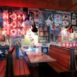
New on The Scene: Hawkers Chapel Hill
I feel like I hit the pot of gold at the end of the rainbow when I coincidentally found Hawkers in Chapel Hill while looking for a place to grab a quick lunch with my daughter. I have been to University Place a few … [Read More...]

Rosé All Day at Seasons 52
I recently had the opportunity to experience the Seasons 52 Summer Menu paired perfectly with Rose cocktails. The menu changes with the season and I can really appreciate that. My reservation was for 7:00pm and it … [Read More...]

NC Social Meetup at The Cowfish Sushi Burger Bar
I can’t seem to get enough of The Cowfish Sushi Burger Bar, it seems like I was just there the other day. That’s because I had dinner at the North Hills Raleigh location with friends last month. It was a very … [Read More...]